Buitoni
Buitoni, a heritage Italian pasta brand, was entering a new chapter after parting ways with Nestlé and reopening its factory in Tuscany. The brand wanted to retain familiar visual cues—including the iconic green packaging, red logo, ingredient photography, and background textures—while introducing a more authentic Tuscan feel. As a designer on the Owen team, I was tasked with developing three distinct visual brand directions, a logo redesign, and packaging concepts that honored Buitoni’s legacy while evolving it for a new era.
Senior Designer: Logo Design, Brand Identity, Packaging Design
My Role
CD: Laura Stull
Senior Designer: Hanna Carter
Copywriter: Harry Maguire
Credits

The challenge was creating something fresh within tight visual boundaries. I began by studying the brand’s heritage and newly reestablished Italian roots, then translated those insights into three creative directions.
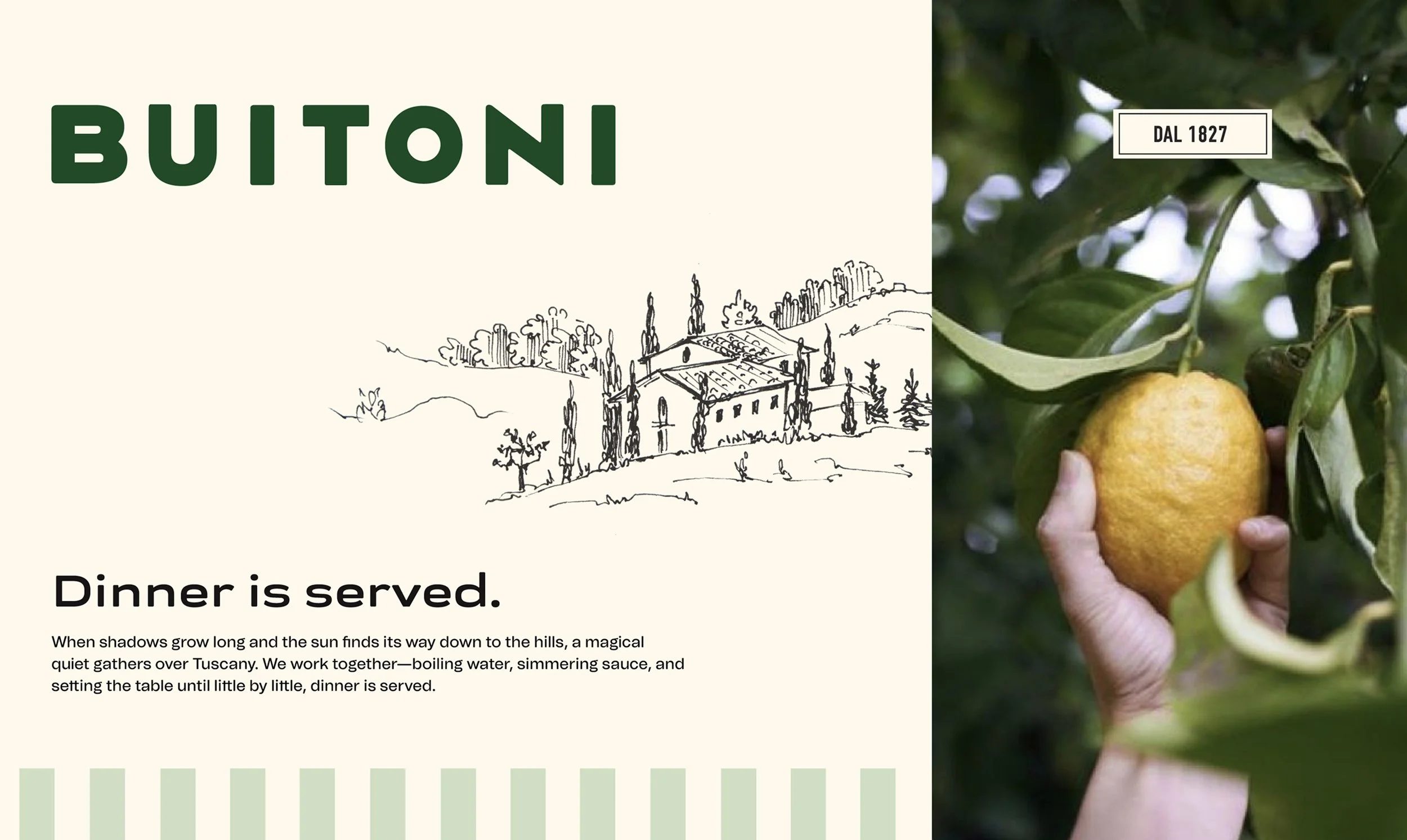
Direction 1 captured a soft, pastoral aesthetic inspired by the Tuscan countryside with elegant typography, subtle greens, and a relaxed, sunlit warmth evoking slow, authentic Italian living.


Direction 2, a more industrious, heritage-driven look, was grounded in Buitoni’s origins in Sansepolcro, Italy, celebrating craftsmanship, family, and tradition through industrial type and rustic textures.


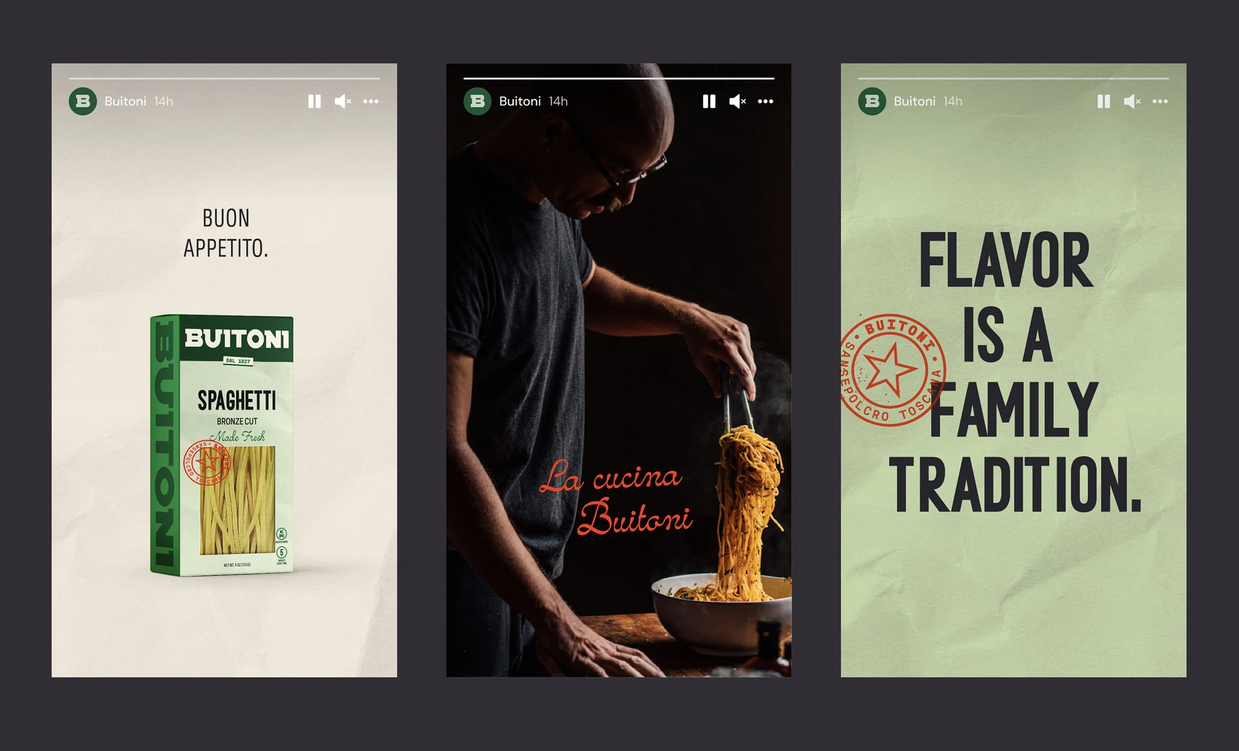
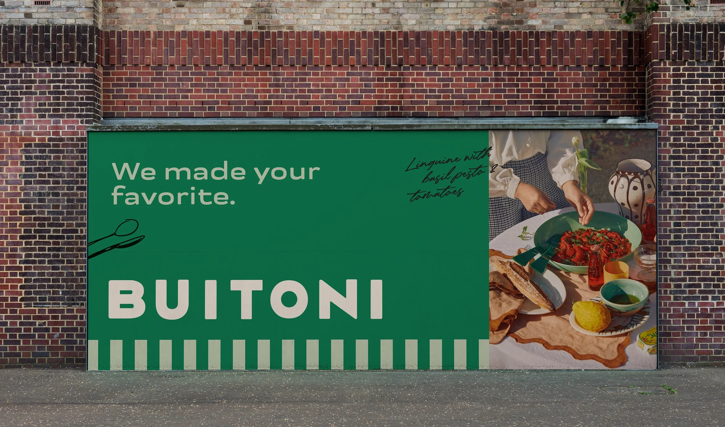
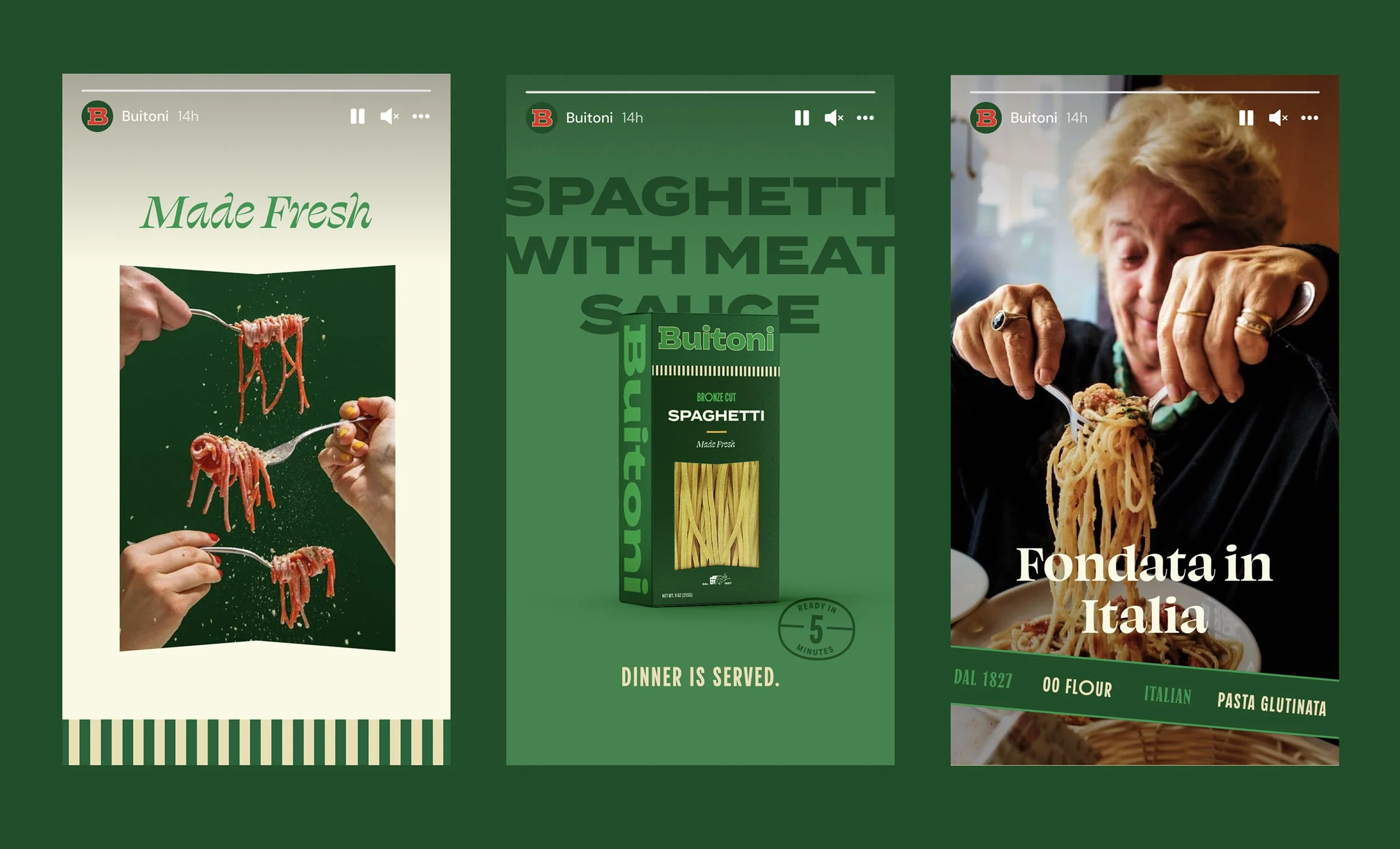
Direction 3 was an evolution of their existing identity using the familiar bright green, refreshed ingredient photography, and a vintage-inspired mark that nodded to their established look. I also included macro-imagery of their ingredients and expressive Italian type to tie back to their roots.


The final refreshed brand struck the perfect balance between tradition and modernity, staying recognizable to loyal customers while communicating genuine Tuscan roots. Seeing the redesigned packaging appear in my neighborhood grocery store—and knowing that this packaging is on shelves all over the world—was deeply rewarding. It's a tangible reminder of how thoughtful evolution can strengthen a brand’s legacy and connection with its audience.


See more work.
See more work.