Under Armour
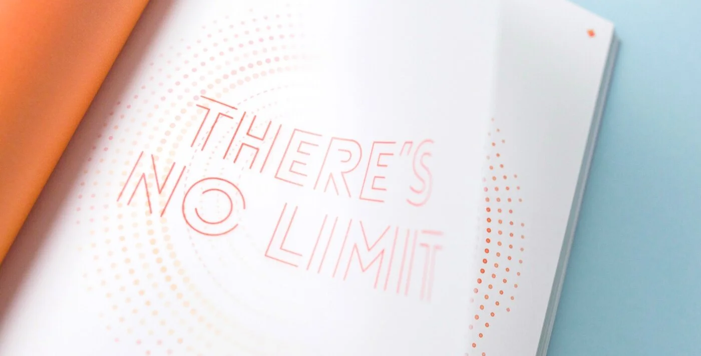
This Spring/Summer lookbook for Under Armour explored the beauty of performance data through infographic illustration. The project translated athletic metrics into a visual language that felt energetic, precise, and expressive.
Designer: Page Layout, Illustration
My Role
CD: Peter Dean
AD: Tess Donohoe
Designer: Rachel Avallone
Credits
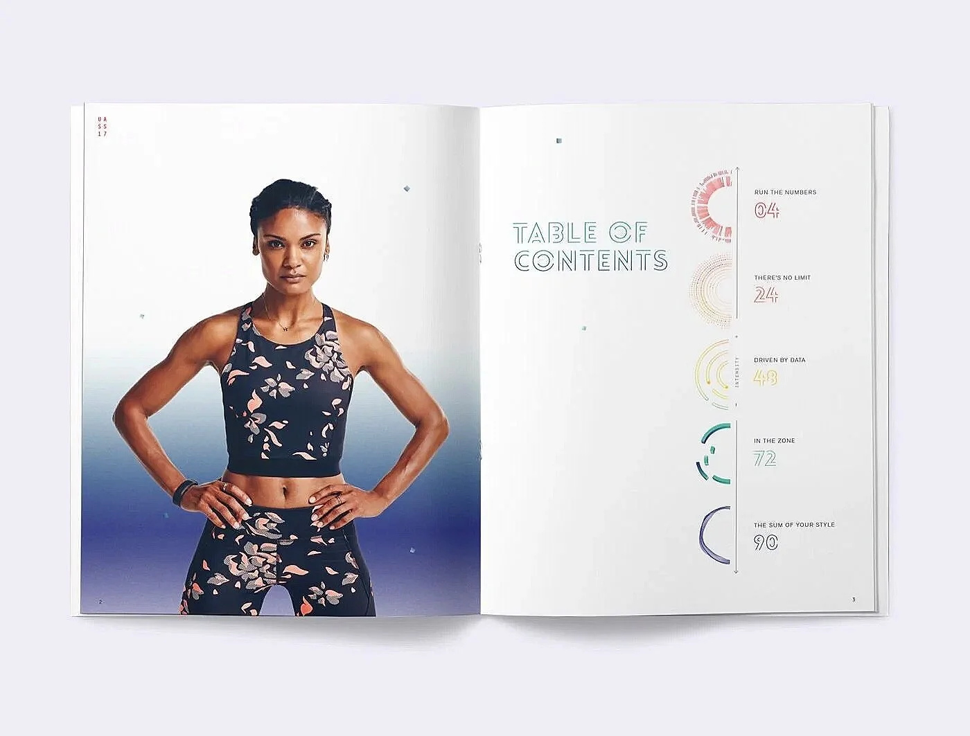
The lookbook was built around the idea of intensity. Content flowed from high intensity training to lower intensity lifestyle movement, clearly communicating which products perform best at different levels of activity. We used a spectrum of color to reinforce this progression, beginning with reds to represent peak athletic intensity and gradually shifting into cooler blues and purples for lifestyle and recovery.
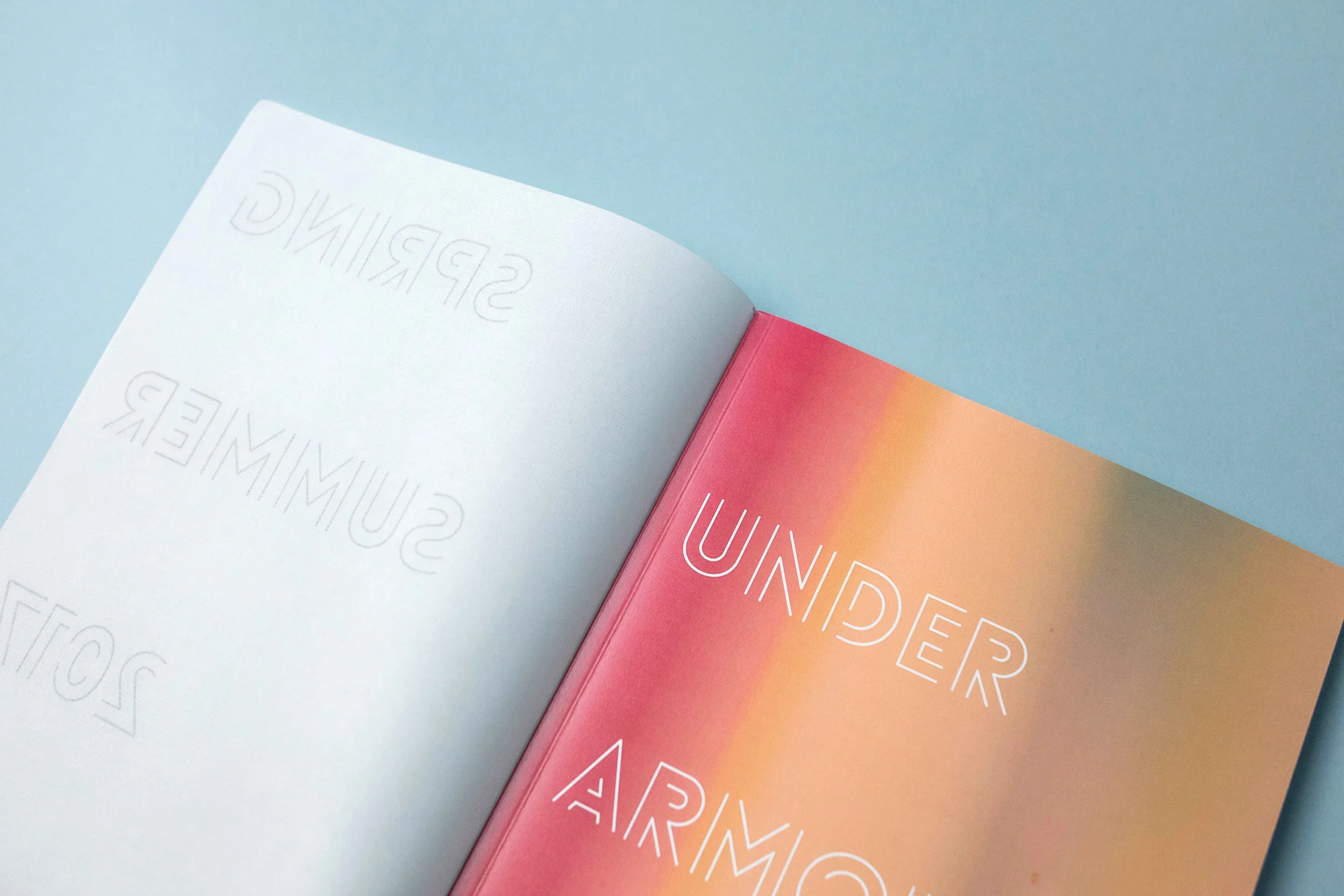
Vellum paper was introduced throughout the book to physically express layers of data and information. Overlapping content, graphics, and imagery mirrored the way performance metrics stack and evolve during activity. A custom display type was selected to feel both sporty and illustrative, reinforcing the graphic system while pushing beyond Under Armour’s typical visual language.
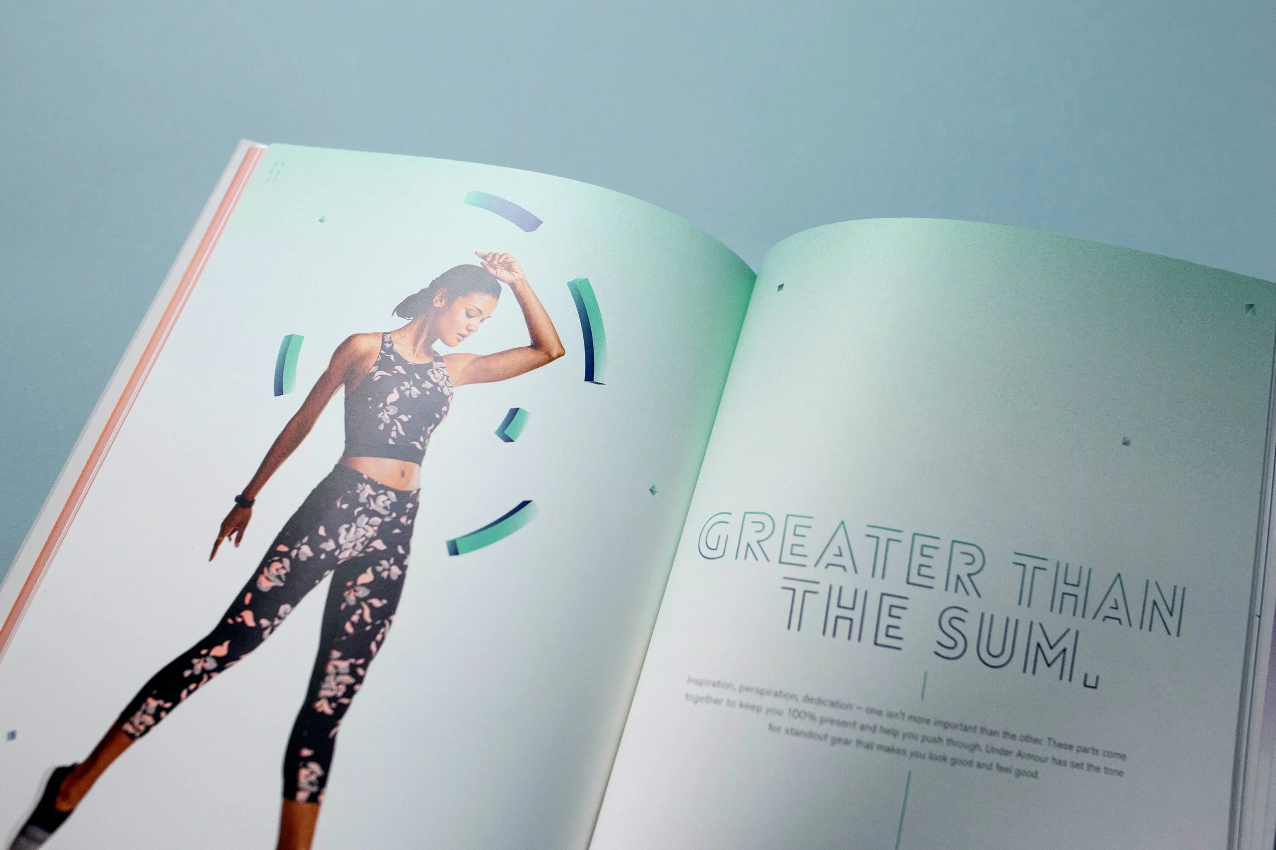
The final lookbook balanced data and emotion in a way that felt fun, artistic, and unexpected for the brand. By combining tactile materials, expressive illustration, and a clear intensity framework, the project pushed the envelope while staying grounded in performance and purpose.

